
Mo
Type Meets Hype: Branding the First Palestinian-American Netflix Series
SERVICES
Visual Identity
Packaging + Print
Mo Amer doesn’t just have two wildly successful Netflix specials to his name. He’s also the first Palestinian-American to write, produce and star in a sitcom for the platform.
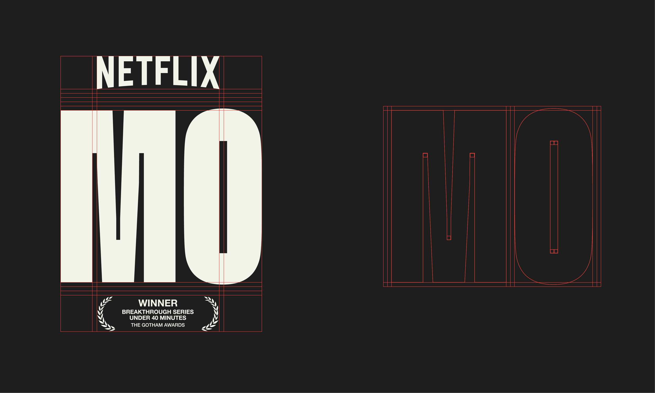
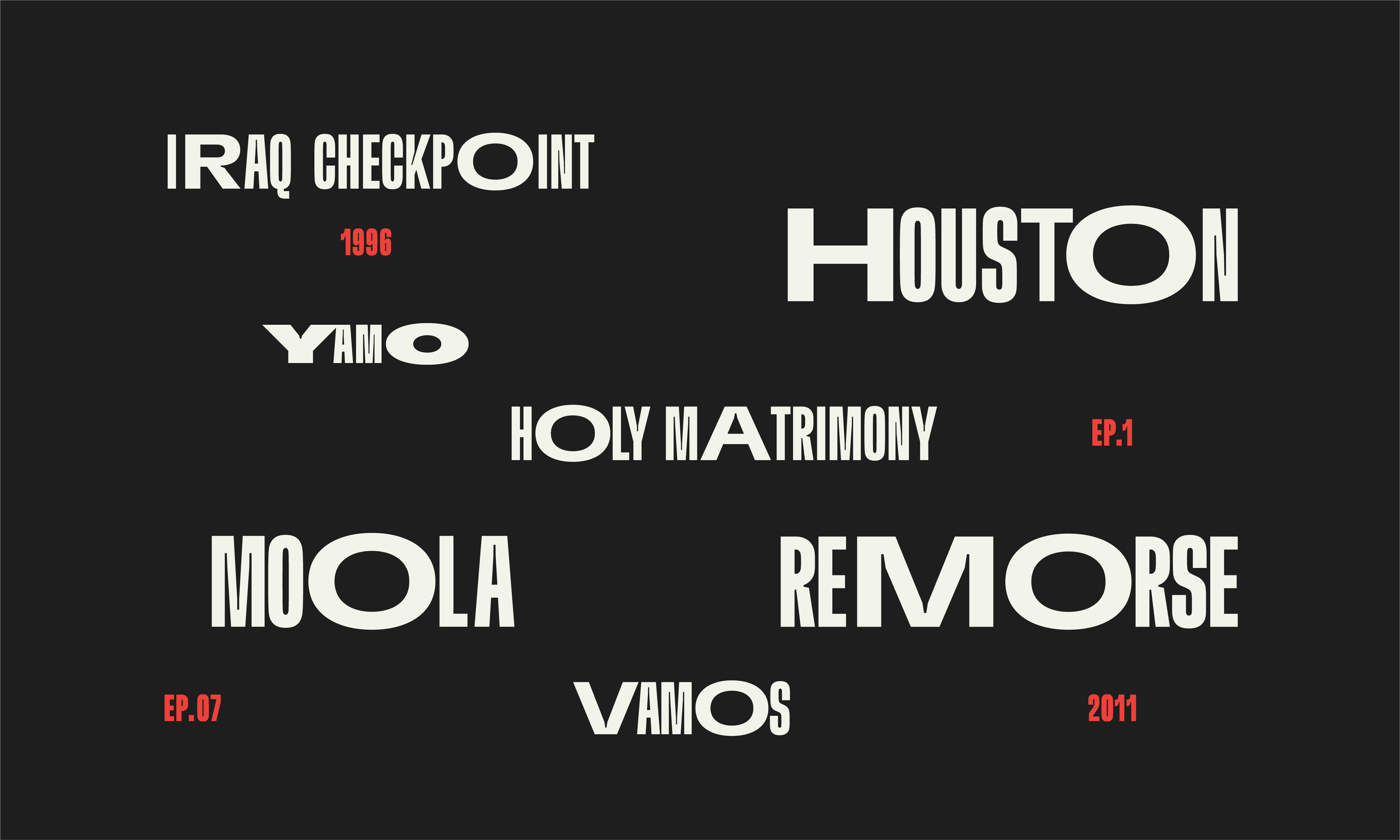
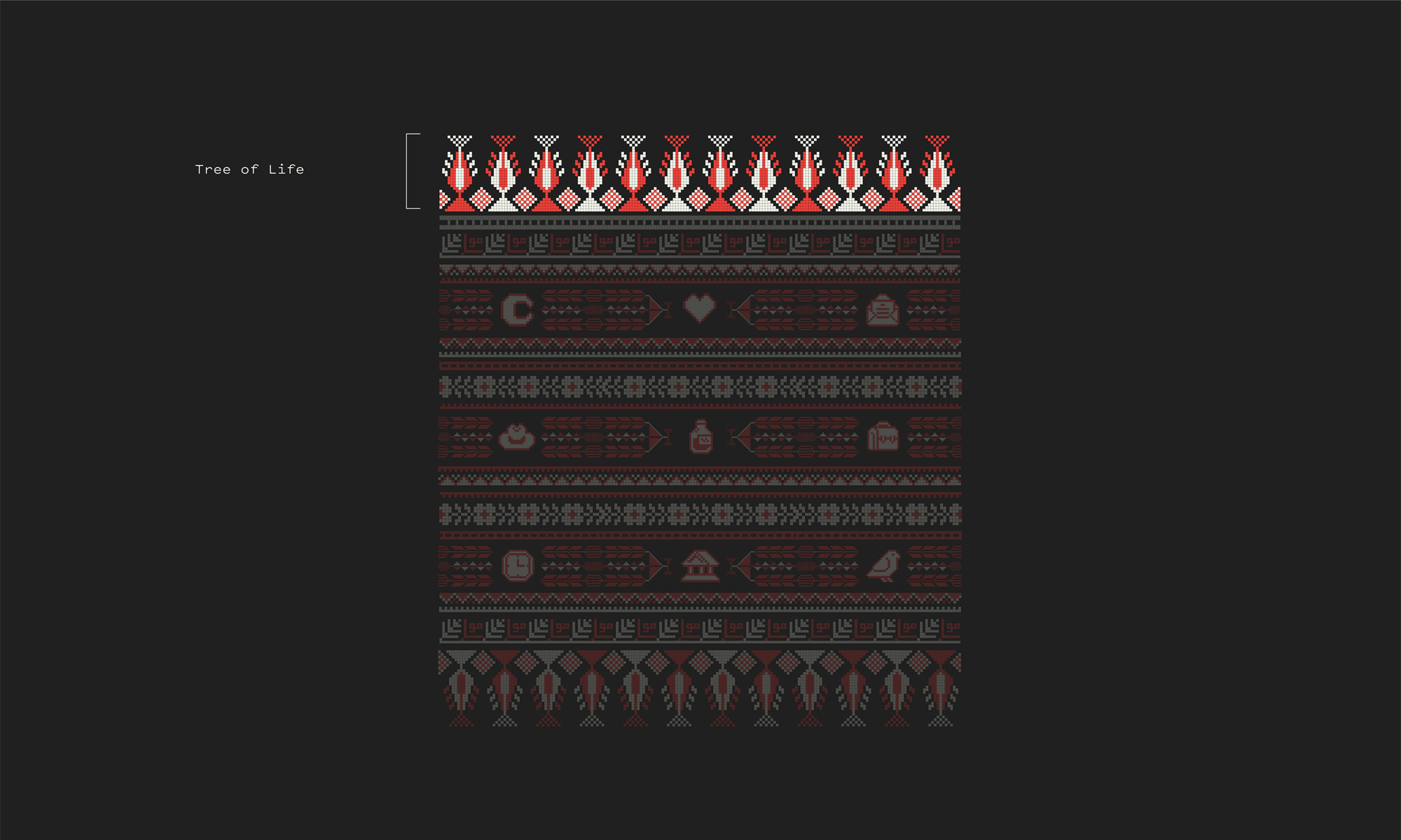
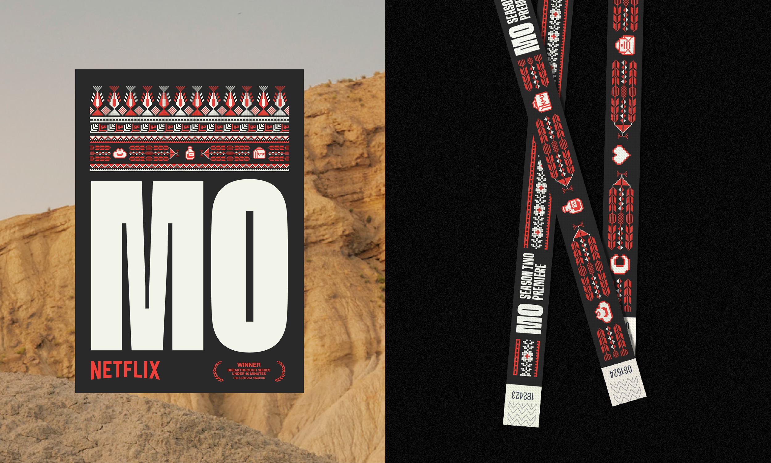
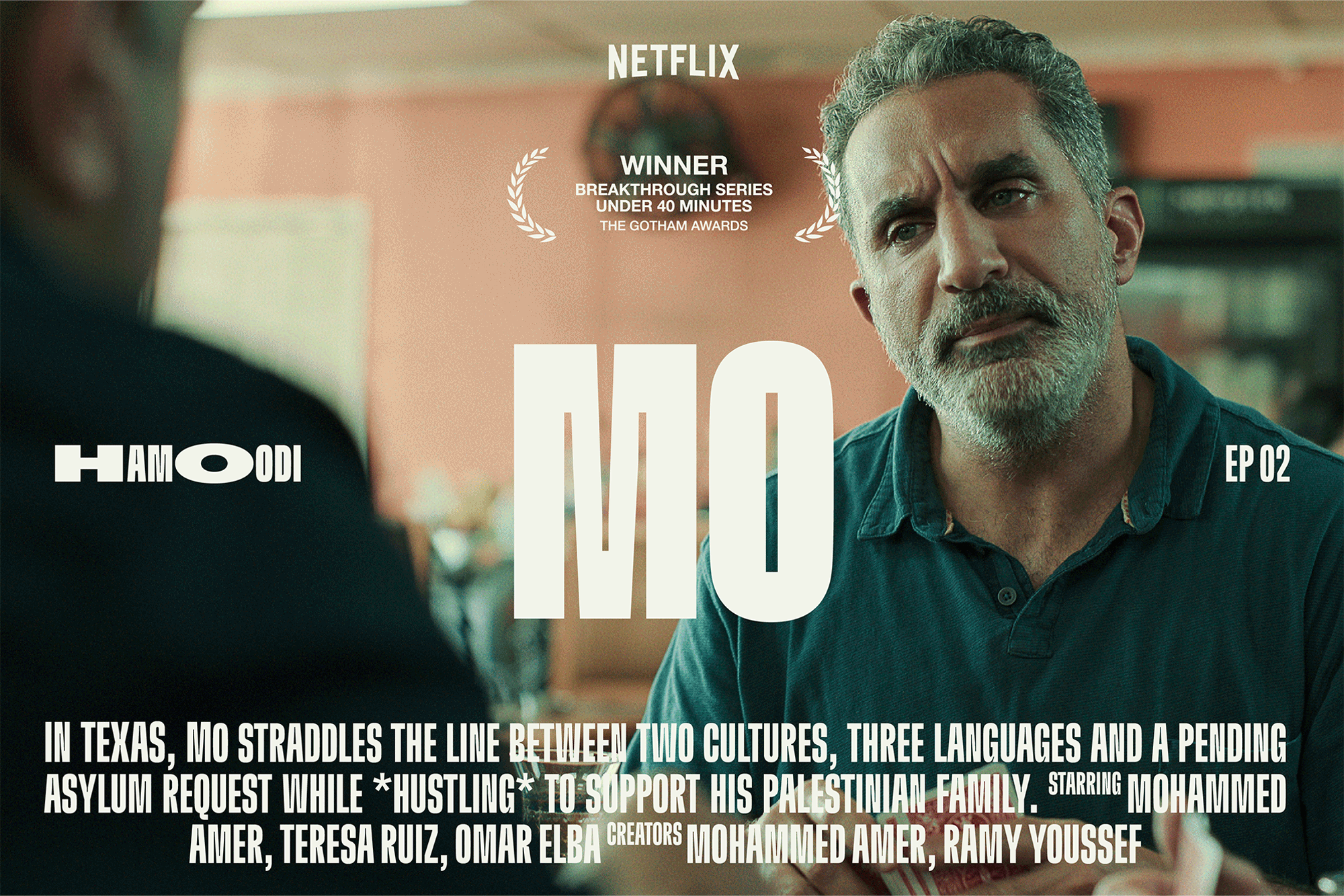
MO on Netflix is a semi-autobiographical tale of a Palestinian refugee in Texas—it’s a thoughtful, often heartbreaking meditation on borders and belonging. We worked with Mo to create the show’s iconic wordmark and promotional campaign. The design strikes a loving balance between tradition and modernity, bringing together the typographic vernaculars of his two homes: Palestine and Houston. Tatreez-style patterns are imbued with symbols from the show’s plot, while commanding letterforms take up space and turn up the volume. The identity invites attention and was built to scale to billboards, thumbnails, award season campaigns and everything in between. It was a pleasure and a privilege to help Mo leave his mark on screens, big and small, near you. Viva Palestina.
↘ The Goods


↘ Impact
I’m thankful to continue to tell a universal story of struggle that relates to so many refugees and millions of underrepresented humans trying to be seen around the globe.
— Mo Amer, Hollywood Reporter
CREDITS
Design: Nermin Moufti
CLIENT TEAM
Mohammed Amer
YEAR
2021
LINKS
